Thursday 24 March 2011

Street Art/Graffiti in London

Street Art that Enhances the Environment
#1. Skate Board Park near the National Theatre 

This piece of street art struck me as particularly appealing and beautiful considering that it was the only "painting-like" piece of street art in the skate board park. A lot of the graffiti in the park has been graffiti-ed on and so there are many walls within the park that have layer upon layer of graffiti with no apparent rhyme or reason. This piece of street work has not been graffiti-ed over and I think that it's because people realize that it's a great piece that enhances the skate board park a great deal. It's image is a heartwarming and sentimental one. It's a piece of street art that speaks of freedom and liberation, a different world underwater. That is exactly what these skateboarders seek when they stand on their skateboards and use a foot to propel them faster and faster and eventually, in the air. They are seeking a sense of freedom and liberation just as well. This piece of street art is by no means vandalism. It has meaning and it is appreciated by those in the environment.


 #2. Portobello Road Market

 
I think that these pieces of street art enhance the Portobello Road Market because it adds character to the neighborhood and the market itself. The market is a long street full of shops offering the most random wares and I would bet that every single person who enters Portobello Road Market leaves with something they hadn't anticipated purchasing. That's the magic of Portobello Road Market: you never know what you will find! I have been to Portobello Road twice before and I had not noticed any graffiti or street art. However, with the intent to spot graffiti, I was able to find these pieces and I have to say that I was pretty pleased with them. They're not random tags with just a name. They're actual stencils or paper-mache like street art pieces. They aren't gaudy and they don't detract from the appeal of Portobello Road. They hide like special little shops that you stumble into accidentally and find something of interest in.

Street Art that Diminishes the Environment
#1: Embankment Bridge
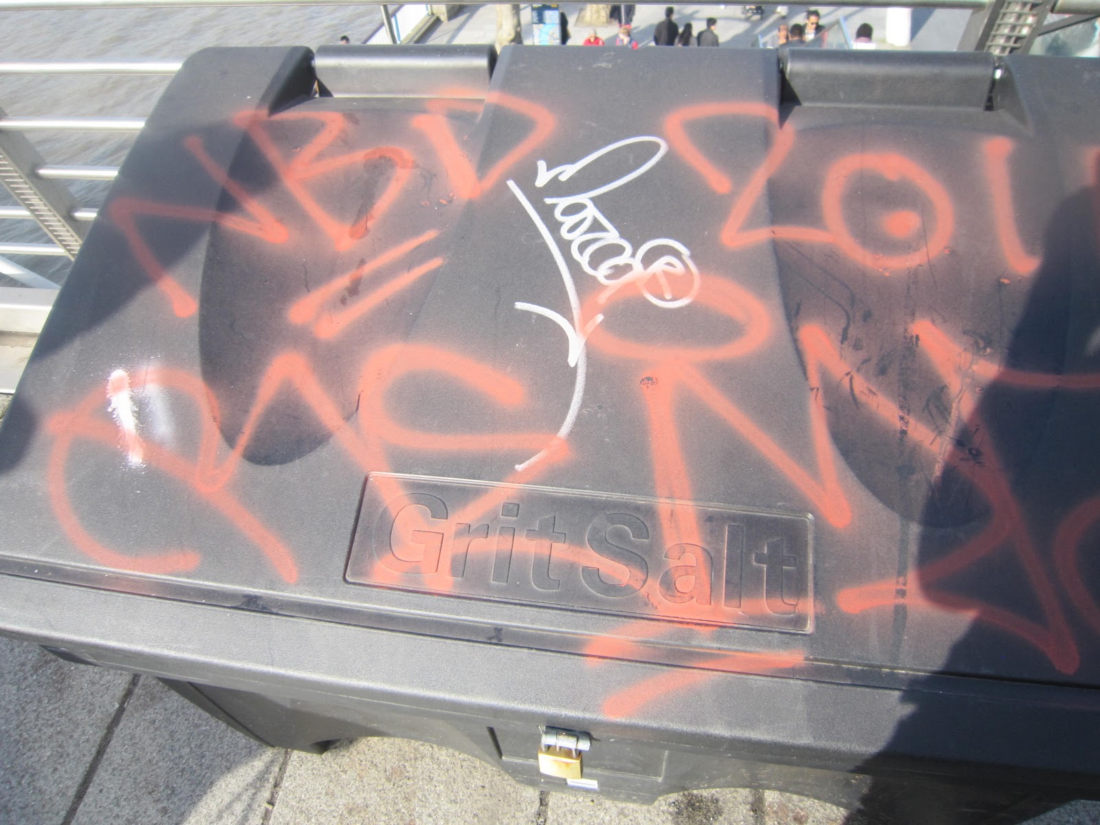


(trash container)

I have to say that the defacement of the Embankment Bridge is graffiti that diminishes the environment. It seems random and pointless. This is what I would call vandalism. There's no purpose to this graffiti because there's no greater purpose beyond marking a territory with a spray can. There's no real beauty in putting stickers all over the wall and spraying random things. This graffiti makes the bridge and its surrounding area look ghetto, in my opinion.

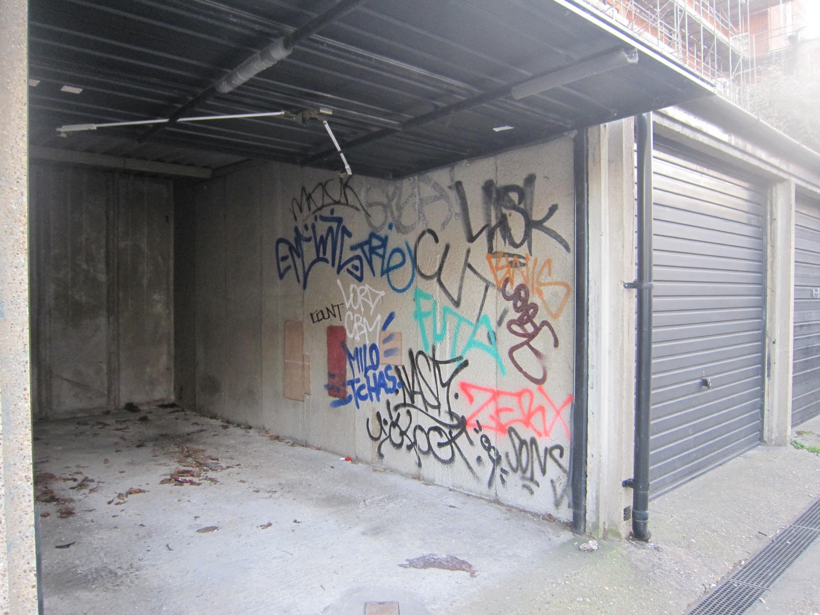
#2: Garage in Portobello Road Market

Feel free to discuss your opinions of vandalism, notions of beauty, historical significance, etc.
I looked at this and I not only did not think it was not beautiful but also that it was straight out an act of vandalism! I can't imagine that the owner of this garage sprayed this graffiti him/her-self. It seems to have been graffiti-ed multiple times. Also, I can't even make out anything that has been written which just makes the graffiti seem even more like vandalism and less like street art. Once again, this is completely lacking purpose. I want to ask these individuals who graffiti-ed this wall "What point are you trying to make? What was your intent behind spray painting this garage wall? Because you know, it's a garage. It's not like a lot of people will see it."

Unless of course, it was an act of revenge against the garage owner! 

Anyway, I digress. This is graffiti that I would not hesitate at washing off. 


Sunday 20 March 2011

The Japan Gallery @ The British Museum

While I stood in awe over the tombstones of various famous figures at Westminster Abbey, Mother Nature was wreaking havoc on the northeast coast of Japan, taking thousands of lives and destroying everything in her path. Charles Dickens, Charles Darwin, Sir Isaac Newton, Robert Browning, and Alfred Tennyson. Queen Elizabeth, Bloody Queen Mary, and Mary Queen of Scots. 

After partaking in an unbelievably delicious meal at the Bombay Brasserie with my program mates, I was more than happy to immerse myself in the history buried in the abbey. So many famous and influential people buried in one spot and I had been granted the opportunity to stand in the very same space as them! I was so excited and jittery, my feet were hopping all the way home.  I returned to the flat still full of awe, ready to share my experience with my roommate, Pa Nhia, and family and friends back home via facebook. 

However, as soon as I opened the door to my room, Pa Nhia perched on her bed asked me, "Did you hear about the earthquake and tsunami in Japan?"

It was like a scene from a movie. It seemed utterly unreal. Like a dummy, I shook my head as if to clear it and said, "What?!"

"Did you hear about the earthquake and tsunami in Japan?" Pa Nhia asked me again, with a sense of urgency.

Now my elation about standing over famous dead bodies seemed small in comparison and pretty lame, to be honest. I read the reports and my heart ached with the rise in body counts and general destruction of the earthquake and the tsunami. 
On March 15th, a few days after the earthquake and tsunami hit Japan, I found myself at the Japan gallery in the British Museum. During my first visit, I didn't make it to any of the Asian galleries because the museum is so massive that it gets very tiring after a couple of hours. Without meaning to, I was drawn to the museum map and I knew that I wanted to go to the Japan exhibit. The moment I walked in, I felt a sense of hushed reverence. It was surprisingly full of people and I realized that I was not the only person drawn to this exhibition of Japanese history and culture due to the recent natural disasters.


I found myself studying the artifacts more closely. I realized how fragile we are as human beings, at the complete mercy of the Earth. I also realized how incredible the task of collecting and itemizing objects for museums are because Mother Nature can take away so quickly what takes us mere humans years upon years to create.


From re-creating a traditional Japanese house,
to preserving and displaying a samurai's gear, 


to showcasing various forms of artwork.


The preservation aspect of museums matters. Sharing the history and culture of a country and its people, it matters. Even though museums are not safe from mother nature's wrath, their attempt to hold these pieces of world history safe and sound so that they can be shared to the public is admirable.


Saturday 5 March 2011

The National Portrait Gallery


1. Critique the logo
The logo is very similar to the logo of The National Gallery. Once again, it's pretty much just a typeface with no indication of what it houses or exhibits within its walls. The curvy-ness of letters makes it stand out somewhat so it's not a completely bland font, but overall, it's still very basic and plain. I don't see how this logo relates to the architecture of the museum or the collections. On a side note, I did see "advertisements" or rather posters that indicated the different portraits exhibited inside. I saw a picture of Kate Winslet and Helen Mirren along with other paintings I did not recognize. Therefore, The National Portrait Gallery did a better job showcasing what they house inside their museum than the National Gallery. 

I don't have any specific suggestions on how they could liven up their logo. I think that the posters they had alongside the fence leading up to the museum was a nice touch, but you wouldn't see those portraits unless you were already standing in front of the museum. There's got to be a better way to incorporate the contents inside into the logo so that anyone interested in visiting the museum would have an idea of what they'd find inside.


2. Self portrait

My self-portrait was based on the painting to the right which is called "Mike's Brother" by by Sam Walsh (oil on masonite, 1964).  This portrait best identifies me because I would've been the ultimate Beatles fan girl if I had been alive back in 1964. I am a sucker for boy bands and if I had been alive during this time, I know I would've had a copy of this print on my bedroom wall. The painting itself fits my personality because of the colors and overall presentation. I loved this painting when I first saw it going up the escalator. The blurriness of the colors adds to the whimsy in this painting, which I appreciate because it reminds me of water color painting back in grade school. It creates a sense of nostalgia. 


3. Study abroad friend: Noel


(Margaret More is the woman with the book in her lap.)

First off, I am really sorry for how bad this drawing is! LOL! It was my very first drawing in years! This was one of the first paintings I saw in the National Portrait Gallery and when I saw that Margaret Moore was in this painting, I knew I had to draw Noel as her. Margaret Moore, or Meg, was the daughter of Thomas More, the author of Utopia. I saw a play about her and apparently, she was a very well educated woman for her time due to her father educating her himself because he believed that women were capable of academic intelligence. Due to her history, I felt that Noel was similar to her in the intelligence aspect because Noel is also a very academic-minded woman. Also, I have no problem imagining Noel in "the olden days." I think if she were ever to pursue acting, she could totally be in a period piece and fit in exceedingly well. I think her mannerisms make her seem more mature and sometimes, more solemn, which fits my idea of women in the past.
 

Additionally, Noel and I (and Meg) share a love of reading and the fact that Meg is painted with an open book in her lap just confirmed for me that she was the one I ought to model a drawing of Noel after. 

(Sir Thomas More, his father, his household and his descendants by Rowland Lockey, after Hans Holbein the Younger
oil on canvas, 1593


4. Study abroad friend: Pa Nhia


I felt that this portrait by John Partidge (1825) best identifies the personality and mood of Pa Nhia. Although the costuming is somewhat masculine, the characterization in the facial expression isn't. It's young and unsure, and yet, happy at the same time. The fact that he's looking to the side instead of straight at the artist also reinforced to me Pa Nhia's shy, introverted nature, which I felt I could see in Partridge's drawing. Also the softness in the shading matches what I view as the softness in Pa Nhia's nature and personality. The sitter in the painting looks like a puppy or a friendly dog like a golden retriever. In that same sense, Pa Nhia's gentle nature and softness matches a pencil portrait.


5. Study abroad friend: Ariel

Self-Portrait
by Ceri Richards
oil on composition board, 1934
When I saw this painting, I was struck by how cool and unique it was, which of course led me to think of Ariel. Ariel is artsy and original. The funkiness of this painting and the cubism effect made me think that this would be the best portrait to model Ariel after. Although she looks kind of masculine in my picture, I based it off of a picture of Ariel that I found on her facebook thus that explains why she has a piercing above her right eye. The mood of the painting matches Ariel's personality because it's very neutral, the colors don't jump out at you and say "Hey, look at me!" You want to look because you know that there's something different about it/her and you want to study it some more. The fact that it's a self-portrait of a painter further convinced me that this was the portrait to model Ariel after.


6. Study abroad friend: Clare
                     

 I chose to model Clare's portrait after Andy Warhols' Queen Elizabeth II. Truth be told, I don't know a whole lot about Queen Elizabeth II. But I know that Clare likes Warhol and I felt that this portrait was a really good fit for Clare because she's an alpha-gal and she could be a CEO of some company or a QUEEN because she's got the personality to lead. She's smart, she's adventurous and she's fit to be a ruler. I think that Clare can appreciate how Warhol took this rather typical portrait of a British monarch and made it cool and hip by playing around with the colors.

Additionally, Clare is going to graduate this semester with a degree in political science, which just further reinforces how much this picture is perfect for superimposing her face onto!