Friday 15 April 2011

The Wallace Collection

1. Labels. Wallace Collection
The way in which the Wallace Collection is labeled is different from what you usually see at museums. There aren't white labels in or around the painting to identify the paintings. The labels for paintings are instead engraved on the frames and it's done in such a way that you can't see the label from far away. If you want to see the label, you have to be quite close to the painting. Due to the salon style hanging, the lack of labels saves space and allows space for a lot of paintings.


I think that the titles and artist names do feel more integrated with the art when labeled that way. It feels like the frame is personalized for the painting and it kind of just looks classier. See how the label is not visible in the picture I took of the painting? But when I zoomed into the bottom of the frame, the label is clearly visible. In person, the label is very easy to see as long as you're standing in front of the painting. I found that this was the case for all of the paintings. I had to take separate pictures of the painting and the label.

I think that this type of labeling is appropriate for the Wallace Collection because it is a highly stylish and decadent collection of art, furniture and armory. The addition of white labels would have detracted from the artistic stylishness of the paintings, the furniture, and the rooms. The absence of the white labels on the walls creates an impression that this is how a really grand home of an aristocratic family would've looked way back when and that's pretty cool for the collection visitors.


2. Object of Appreciation. Wallace Collection
The entire Wallace Collection was very impressive and aesthetically pleasing to see. There are so many objects to appreciate that my object of appreciation changed as I went through the exhibit. As I was on my way out, I happened to see these delicate, gorgeously detailed snuff boxes and I fell in love! They were so colorful and pretty. Initially, I thought that they were jewelry boxes but then I realized they were too small to hold more than a couple of earrings or rings. These snuff boxes are just delightful little pieces of art. I want one so bad!!!


3. Object of Excessive details/ornamentation Wallace Collection
Considering the decadence of many of the items in the Wallace Collection, it wasn't too difficult to pick out excessively detailed or ornamented items. However, to pick the item that for me was viscerally, personally the most distasteful was a bit trickier to do because I enjoyed most of the excessively decorated and lavish things in the collection. 

However, when I saw this writing desk, I was delighted because I knew that it would be my object of excessive details/ornamentation. It was just too much for my taste! Gaudy gaudy gaudy and overdone.

 From the front.


 Elaborate candle holder. 


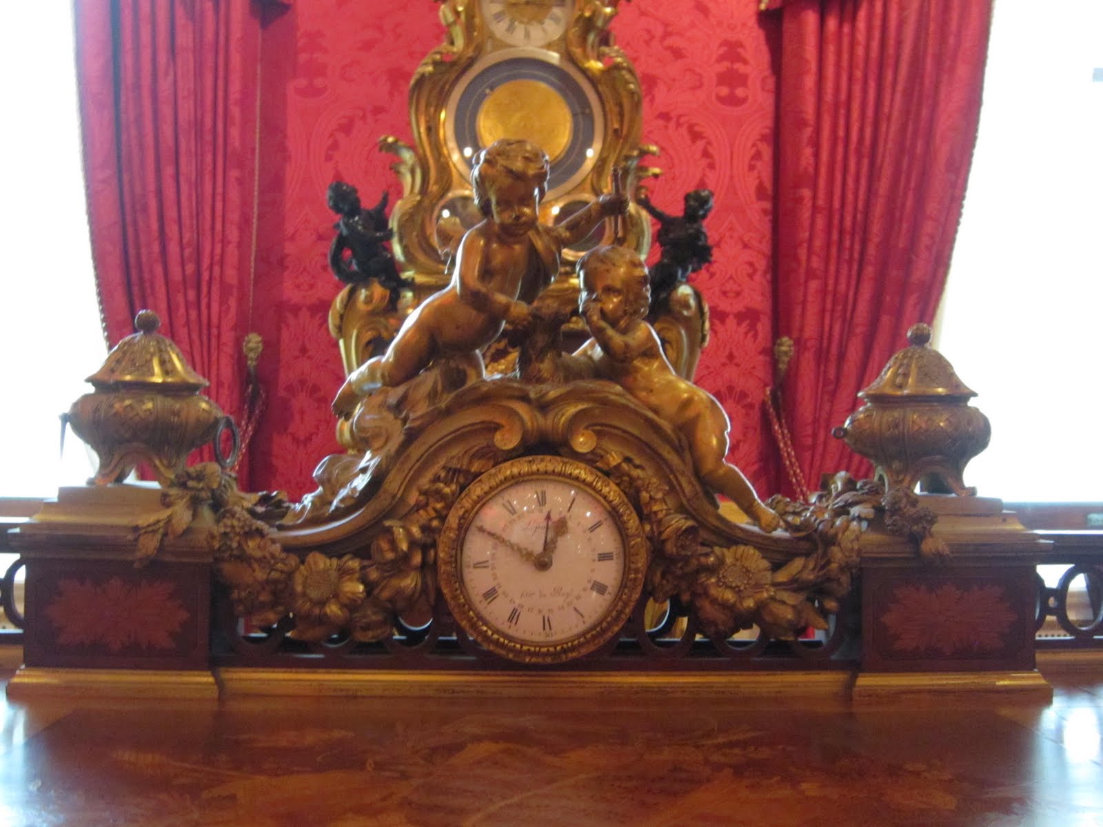
 Really nice clock. But does it really need to be gold?! 


Side view. 

 View from behind. 


The clock has TWO faces because you need to be able to tell the time when standing behind, of course!

 All in all, this writing desk was just too much. I'm sure this must've been owned by some aristocrat because it could have probably fed a poor family for years back in the 1700s!

4. Favorite Museum
It's hard to pick one museum considering London has so many great and free museums. But I suppose I have a soft spot for the Victoria and Albert Museum and the British Museum. Call me crazy, but the humorous incident with that Asian girl who followed us at our very first visit to the British Museum will stay in my memory of this study abroad program forever. It's just one of those ridiculous incidents that stays with you because of how harmless it was and how much it bothered all of us. I didn't think I would be the type of person who would be bothered by that sort of thing, but I was super annoyed when it was happening! If looks can kill, that girl would've been dead considering the amount of Badger Death Glares she was on the receiving end of! *sigh* Great LOL moment! How horrible. The most memorable museum experience didn't even involve art, but rather just a person to person interaction. 

As for the V&A, I've been there three times and I could've gone back a forth. I love it. They don't have the most famous pieces of art, but there's a variety in their collection, something for everyone. I would definitely recommend the British Museum for people who like history and world cultures and the V&A for people who like a mixture of sculptures, clothing/costume, and artifacts. And jewelry too! Their jewelry room was AMAZING and any woman would love it.


5. Museum Interest
I loved museums before I came to London, but it wasn't something that I thought about often. I went to the Milwaukee Public Museum once in the 2nd grade. I've been to the Chazen 3 or 4 times during my 5 years of undergrad. And I've been to the Metropolitan Museum of Art once in New York (I LOVED this museum). So I knew I enjoyed museums, but I had no idea how accessible museums would be in London. It is one of the greatest things about London, hands down. 

As a result of this course, I have an interest to continue visiting museums where I can. Madison, Milwaukee, Chicago, here I come! I was intimidated by art before this course (and still am) because I was never so interested in art that I could throw out names like "I really appreciate the colors that So-So uses in her work," etc etc. I just knew what I liked and what I didn't. I never wanted to share my opinion in case it was "wrong" or "misinformed." But I feel more comfortable with art now. I would say that I was previously intimidated by art, but fascinated by it at the same time. Now, I am less intimidated by art and by museums. I don't have to know big names in the art world. I don't have to know the period the piece came from. I just need to continue to nurture my love for art. 

Do I have a greater interest in museum branding? Um, no. Sorry, but I don't! There are exceptions, but most museums go the safe route and are very plain and bland with their brands and truth me told, that's fine with me because I'm more interested in what's on the inside. If word of mouth takes me to a museum, I could care less if their logo is lame and uninteresting.


6. Any additional comments
You said to me when I met you at the study abroad fair that this class was going to be all about fun and visiting museums and you more than fulfilled what you promised. Thank you for the wonderful museum experiences. It was everything I could've wished for and as a lover of museums, I feel like I am more aware and appreciative of museums as a result of this course.

Sunday 10 April 2011

Design Museum


Brit Insurance Design Awards: Your Vote
Which design would you honor for innovation in the following categories:
(list the object title and provide a two sentence response for the innovative selection)

Architecture: Origin Part 1: Join by BCXSY (and Mr. Tanaka)
 
 I liked this piece, Join the most architecturally because I felt that it took something old and familiar and made it interesting. In person, the sharp angles at which the shapes collide are interesting because they are so precise and yet, so masterfully smooth. The workmanship that must have gone into making these dividers blows my mind. 


Furniture: Solo Bench by Domingos Totora

I liked this bench because it reminded me of a caterpillar. It was firm and comfortable, and yet still fully functional as a bench. The neutral color doesn't make it stand out very much, but it is super comfortable and different, so it's a winner for me!


Transport: EN-V by General Motors

My favorite transportation design was hands down the EN-V by GM. These cars are so cute! They fit one or two people only and are supposed to be more eco-friendly than normal automobiles. The designs of the EN-V look futuristic and unique compared to the cars of today. For creativity, I vote A+!

Graphics: I WONDER by MARIAN BANTJES 

I liked this graphic design the most because I felt that caught my eye and it seemed like a treasure chest in the form of a book! I didn't realize at the time that Marian actually designed the book cover herself! You can see how intricate the design is in person, but to see the design, step by step, is even more amazing because the entire cover is so damn symmetrical and precise. This cover is a work of art in itself! Bravo!!!!

To see a detailed step by step creation of the book cover: http://observatory.designobserver.com/entry.html?entry=15668


Wim Crouwel: A Graphic Odyssey 

I was initially very overwhelmed by Crouwel's exhibition because the white walls and white tables were packed full of prints in frames. None of the pieces drew my eyes to it upon first glance because Crouwel's pieces are either very minimal and black and white or minimal and colorful. Also, all of the sharp shapes and stripes made my head dizzy after staring for too long. I don't think that this work is too minimal by any means because even though his designs don't bombard you with different visuals, overall, his designs are very creative and unique. I was surprised at the variety in his work considering his minimal design style. Adjectives that I would use to describe this exhibition are stripey, geometric, repetition, space-y (as in outer space), and slanted/asymmetrical lines.

When I looked at posters by Wim Crouwel, I kept thinking back to Bridget Riley's work because they make me dizzy if I stare at it for too long. Riley's precision in her paintings is a similarity that also shows up in Crouwel's work especially since both like to use geometric shapes with repetition.


Saturday 2 April 2011

Saatchi Gallery

Sightlines

The Saatchi gallery enabled various sight lines within the museum due to the interesting architecture of the building interior and due to the spacious hangings of the art pieces on the walls and on the floor. There were many rooms and many floors in a relatively small building, but I wasn't overwhelmed or discouraged from perusing from room to room because each one was so unique and offered something different. One really good example of utilizing the architecture of the building is the installation piece by Ximena Garrido-Lecca. This piece of installation art was an enormous reproduction of a burial wall as it exists from her native country of Peru.


It took up the entire wall in the gallery and while that in itself was impressive, once you got to the second floor, there was a balcony where you could stand, thrust out into that very same gallery, and have a better view of the top half of the installation piece. The balcony enabled a different sight line from a higher vantage point. I don't think I've seen this type of multiple-sight line viewing of a piece of art at a museum before. This made the Saatchi Gallery stand out as unique. 

Another aspect to the Saatchi Gallery that I appreciated was that I never felt overwhelmed in a room, despite the various pieces hanging on the wall or hanging from the ceiling. The white walls created a neutral palette and the spacing between the pieces of artwork allowed you to look at each piece with patience and calm. 


Overall, the utter lack of interruption allowed for more contemplation...which leads me to the next question.


Didactics
As a non-art major, as someone who enjoys the aesthetic aspect of artwork and needs a little bit of help in order to contextualize artwork...I would say that the text at the Saatchi Gallery is NOT adequate! I know that it is not the Saatchi's policy to hand feed art to people, but when you're going to put on display artwork that may be, pardon my French, like a brainfuck, to some people, it would be nice to give it a bit of context instead of no context at all! I found the tour guide to be invaluable with the information that she provided regarding the artist behind the piece and the context in which the piece was constructed. I don't need, nor am I asking, to be hand fed the meaning of a painting or sculpture, but I was thoroughly annoyed at how utterly blank I felt sometimes looking at certain pieces in the gallery. I think the question that came up the most often in my head was, "What is this? What am I supposed to take away from this?"

I know that art is subjective and there's not one right answer, but the artist must have had a reason for constructing such a piece just so or something that he/she was trying to create or question.  Information that I would have appreciated would have been very clearly:
  • Name of art piece
  • Artist name
  • Artist DOB and death, if applicable
  • Country of origin
  • Interests (as in topics or subjects the artist favors), if applicable

Collection
I would definitely say that the Saatchi is more adventurous than the previous museums I've been to and so much so, that I would question if they are pushing the envelope and saying "We're displaying this and therefore it is art," or if they're being all tongue in cheek about it and saying "We're displaying this, declaring it art, and we want to push your conceptions of what is art because in reality, this is crap."
The Saatchi Gallery made me question what makes art art. Or maybe, what makes a person's artwork arty enough that it can be displayed in a gallery and sold for money? 
I'm so used to appreciating the classic definition of art and what it means to be an artiste, that I have a really difficult time seeing abstract, modern art as being art. I know that that is my personal bias, weakness, etc. but because of this I felt that some of the pieces at the Saatchi were not worthy of being displayed at a gallery e.g. the spam posters. Maybe the fact that the Saatchi Gallery is willing to step outside of the box and not be bound by traditional (archaic?) definitions of art is what makes it such a daring and unique gallery! That in itself could be the very strength of the gallery. There are plenty of galleries and museums displaying the traditional sorts of art that are considered art, and maybe even masterpieces. For that reason alone, the Saatchi should be appreciated for its eclectic and eccentric collection.

Thursday 24 March 2011

Street Art/Graffiti in London

Street Art that Enhances the Environment
#1. Skate Board Park near the National Theatre 

This piece of street art struck me as particularly appealing and beautiful considering that it was the only "painting-like" piece of street art in the skate board park. A lot of the graffiti in the park has been graffiti-ed on and so there are many walls within the park that have layer upon layer of graffiti with no apparent rhyme or reason. This piece of street work has not been graffiti-ed over and I think that it's because people realize that it's a great piece that enhances the skate board park a great deal. It's image is a heartwarming and sentimental one. It's a piece of street art that speaks of freedom and liberation, a different world underwater. That is exactly what these skateboarders seek when they stand on their skateboards and use a foot to propel them faster and faster and eventually, in the air. They are seeking a sense of freedom and liberation just as well. This piece of street art is by no means vandalism. It has meaning and it is appreciated by those in the environment.


 #2. Portobello Road Market

 
I think that these pieces of street art enhance the Portobello Road Market because it adds character to the neighborhood and the market itself. The market is a long street full of shops offering the most random wares and I would bet that every single person who enters Portobello Road Market leaves with something they hadn't anticipated purchasing. That's the magic of Portobello Road Market: you never know what you will find! I have been to Portobello Road twice before and I had not noticed any graffiti or street art. However, with the intent to spot graffiti, I was able to find these pieces and I have to say that I was pretty pleased with them. They're not random tags with just a name. They're actual stencils or paper-mache like street art pieces. They aren't gaudy and they don't detract from the appeal of Portobello Road. They hide like special little shops that you stumble into accidentally and find something of interest in.

Street Art that Diminishes the Environment
#1: Embankment Bridge


(trash container)

I have to say that the defacement of the Embankment Bridge is graffiti that diminishes the environment. It seems random and pointless. This is what I would call vandalism. There's no purpose to this graffiti because there's no greater purpose beyond marking a territory with a spray can. There's no real beauty in putting stickers all over the wall and spraying random things. This graffiti makes the bridge and its surrounding area look ghetto, in my opinion.

#2: Garage in Portobello Road Market

Feel free to discuss your opinions of vandalism, notions of beauty, historical significance, etc.
I looked at this and I not only did not think it was not beautiful but also that it was straight out an act of vandalism! I can't imagine that the owner of this garage sprayed this graffiti him/her-self. It seems to have been graffiti-ed multiple times. Also, I can't even make out anything that has been written which just makes the graffiti seem even more like vandalism and less like street art. Once again, this is completely lacking purpose. I want to ask these individuals who graffiti-ed this wall "What point are you trying to make? What was your intent behind spray painting this garage wall? Because you know, it's a garage. It's not like a lot of people will see it."

Unless of course, it was an act of revenge against the garage owner! 

Anyway, I digress. This is graffiti that I would not hesitate at washing off. 


Sunday 20 March 2011

The Japan Gallery @ The British Museum

While I stood in awe over the tombstones of various famous figures at Westminster Abbey, Mother Nature was wreaking havoc on the northeast coast of Japan, taking thousands of lives and destroying everything in her path. Charles Dickens, Charles Darwin, Sir Isaac Newton, Robert Browning, and Alfred Tennyson. Queen Elizabeth, Bloody Queen Mary, and Mary Queen of Scots. 

After partaking in an unbelievably delicious meal at the Bombay Brasserie with my program mates, I was more than happy to immerse myself in the history buried in the abbey. So many famous and influential people buried in one spot and I had been granted the opportunity to stand in the very same space as them! I was so excited and jittery, my feet were hopping all the way home.  I returned to the flat still full of awe, ready to share my experience with my roommate, Pa Nhia, and family and friends back home via facebook. 

However, as soon as I opened the door to my room, Pa Nhia perched on her bed asked me, "Did you hear about the earthquake and tsunami in Japan?"

It was like a scene from a movie. It seemed utterly unreal. Like a dummy, I shook my head as if to clear it and said, "What?!"

"Did you hear about the earthquake and tsunami in Japan?" Pa Nhia asked me again, with a sense of urgency.

Now my elation about standing over famous dead bodies seemed small in comparison and pretty lame, to be honest. I read the reports and my heart ached with the rise in body counts and general destruction of the earthquake and the tsunami. 
On March 15th, a few days after the earthquake and tsunami hit Japan, I found myself at the Japan gallery in the British Museum. During my first visit, I didn't make it to any of the Asian galleries because the museum is so massive that it gets very tiring after a couple of hours. Without meaning to, I was drawn to the museum map and I knew that I wanted to go to the Japan exhibit. The moment I walked in, I felt a sense of hushed reverence. It was surprisingly full of people and I realized that I was not the only person drawn to this exhibition of Japanese history and culture due to the recent natural disasters.


I found myself studying the artifacts more closely. I realized how fragile we are as human beings, at the complete mercy of the Earth. I also realized how incredible the task of collecting and itemizing objects for museums are because Mother Nature can take away so quickly what takes us mere humans years upon years to create.


From re-creating a traditional Japanese house,
to preserving and displaying a samurai's gear, 


to showcasing various forms of artwork.


The preservation aspect of museums matters. Sharing the history and culture of a country and its people, it matters. Even though museums are not safe from mother nature's wrath, their attempt to hold these pieces of world history safe and sound so that they can be shared to the public is admirable.


Saturday 5 March 2011

The National Portrait Gallery


1. Critique the logo
The logo is very similar to the logo of The National Gallery. Once again, it's pretty much just a typeface with no indication of what it houses or exhibits within its walls. The curvy-ness of letters makes it stand out somewhat so it's not a completely bland font, but overall, it's still very basic and plain. I don't see how this logo relates to the architecture of the museum or the collections. On a side note, I did see "advertisements" or rather posters that indicated the different portraits exhibited inside. I saw a picture of Kate Winslet and Helen Mirren along with other paintings I did not recognize. Therefore, The National Portrait Gallery did a better job showcasing what they house inside their museum than the National Gallery. 

I don't have any specific suggestions on how they could liven up their logo. I think that the posters they had alongside the fence leading up to the museum was a nice touch, but you wouldn't see those portraits unless you were already standing in front of the museum. There's got to be a better way to incorporate the contents inside into the logo so that anyone interested in visiting the museum would have an idea of what they'd find inside.


2. Self portrait

My self-portrait was based on the painting to the right which is called "Mike's Brother" by by Sam Walsh (oil on masonite, 1964).  This portrait best identifies me because I would've been the ultimate Beatles fan girl if I had been alive back in 1964. I am a sucker for boy bands and if I had been alive during this time, I know I would've had a copy of this print on my bedroom wall. The painting itself fits my personality because of the colors and overall presentation. I loved this painting when I first saw it going up the escalator. The blurriness of the colors adds to the whimsy in this painting, which I appreciate because it reminds me of water color painting back in grade school. It creates a sense of nostalgia. 


3. Study abroad friend: Noel


(Margaret More is the woman with the book in her lap.)

First off, I am really sorry for how bad this drawing is! LOL! It was my very first drawing in years! This was one of the first paintings I saw in the National Portrait Gallery and when I saw that Margaret Moore was in this painting, I knew I had to draw Noel as her. Margaret Moore, or Meg, was the daughter of Thomas More, the author of Utopia. I saw a play about her and apparently, she was a very well educated woman for her time due to her father educating her himself because he believed that women were capable of academic intelligence. Due to her history, I felt that Noel was similar to her in the intelligence aspect because Noel is also a very academic-minded woman. Also, I have no problem imagining Noel in "the olden days." I think if she were ever to pursue acting, she could totally be in a period piece and fit in exceedingly well. I think her mannerisms make her seem more mature and sometimes, more solemn, which fits my idea of women in the past.
 

Additionally, Noel and I (and Meg) share a love of reading and the fact that Meg is painted with an open book in her lap just confirmed for me that she was the one I ought to model a drawing of Noel after. 

(Sir Thomas More, his father, his household and his descendants by Rowland Lockey, after Hans Holbein the Younger
oil on canvas, 1593


4. Study abroad friend: Pa Nhia


I felt that this portrait by John Partidge (1825) best identifies the personality and mood of Pa Nhia. Although the costuming is somewhat masculine, the characterization in the facial expression isn't. It's young and unsure, and yet, happy at the same time. The fact that he's looking to the side instead of straight at the artist also reinforced to me Pa Nhia's shy, introverted nature, which I felt I could see in Partridge's drawing. Also the softness in the shading matches what I view as the softness in Pa Nhia's nature and personality. The sitter in the painting looks like a puppy or a friendly dog like a golden retriever. In that same sense, Pa Nhia's gentle nature and softness matches a pencil portrait.


5. Study abroad friend: Ariel

Self-Portrait
by Ceri Richards
oil on composition board, 1934
When I saw this painting, I was struck by how cool and unique it was, which of course led me to think of Ariel. Ariel is artsy and original. The funkiness of this painting and the cubism effect made me think that this would be the best portrait to model Ariel after. Although she looks kind of masculine in my picture, I based it off of a picture of Ariel that I found on her facebook thus that explains why she has a piercing above her right eye. The mood of the painting matches Ariel's personality because it's very neutral, the colors don't jump out at you and say "Hey, look at me!" You want to look because you know that there's something different about it/her and you want to study it some more. The fact that it's a self-portrait of a painter further convinced me that this was the portrait to model Ariel after.


6. Study abroad friend: Clare
                     

 I chose to model Clare's portrait after Andy Warhols' Queen Elizabeth II. Truth be told, I don't know a whole lot about Queen Elizabeth II. But I know that Clare likes Warhol and I felt that this portrait was a really good fit for Clare because she's an alpha-gal and she could be a CEO of some company or a QUEEN because she's got the personality to lead. She's smart, she's adventurous and she's fit to be a ruler. I think that Clare can appreciate how Warhol took this rather typical portrait of a British monarch and made it cool and hip by playing around with the colors.

Additionally, Clare is going to graduate this semester with a degree in political science, which just further reinforces how much this picture is perfect for superimposing her face onto!